Hubb Design Systems
Brand Audit
Brand Strategy
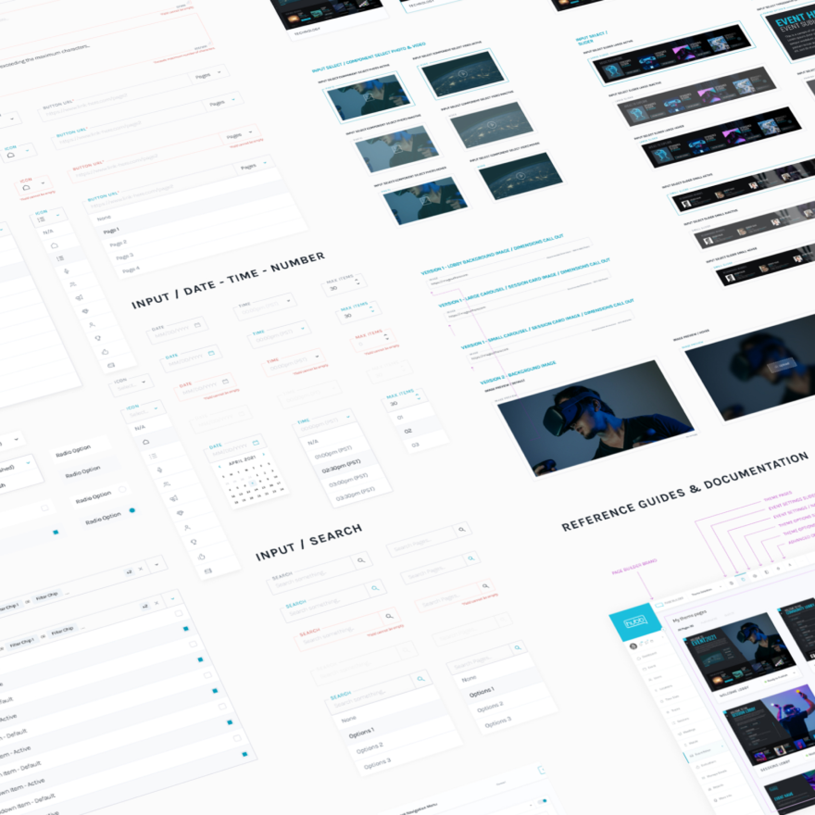
Component Library
Component Reference Guides
Custom Iconography
Data Visualization
Design System Architecture
Information Architecture (IA)
Prototypes
Scalable Design System
UX/UI (User Experience, User Interface)
User Flow
User Journey Mapping
WCAG & ADA Compliance
Web Application
Wireframes
What is a design system?
A design system is an evolving collection of every resource, asset, and component of a brand, along with clear guidelines for how they are each to be used. This powerful component system can be assembled to build any number of applications—it’s a collaborative tool for your design product. And just like your product, a design system continues to grow and adapt over time.
For Hubb, we took the start of an existing brand and adapted it to an entire system which we continue to build on as their needs grow. Piecing together elements from the existing brand, we took what was working and incorporated it into the new elements we created to suit their branding.

The Challenge.
The initial challenge was the lack of a standardized design language, leading to inconsistencies in the user interface across various modules of the Hubb SaaS application. Not only did the inconsistent interface make for a poor user experience, but it also made design and development very inefficient. The need for a comprehensive design system became evident to address these issues, elevate the overall user experience, and streamline the development process.
The Solution.
Our design team collaborated with developers and stakeholders to create a comprehensive design system that encompassed a unified set of design principles, components, and patterns. This design system served as a single source of truth for the visual and interactive elements of our SaaS application.
The End Result.
The integration of a design system has helped streamline the user experience, foster consistency, and accelerate development for the Hubb platform. The streamlined design language, consistent components, and enhanced development efficiency not only met the initial challenges but positioned the Hubb platform for continued growth and innovation in the world of digital events.


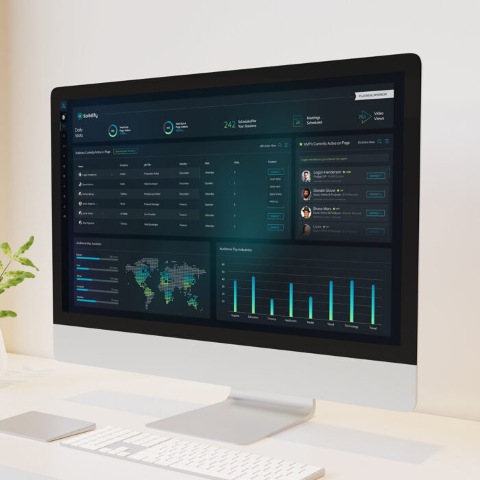
Managing product consistency.
Creating design consistency across multiple large-scale digital products is critical. Implementing a design system creates a unified visual language across the entire digital product which also builds trust and recognition with your audience. Every design detail matters when shaping the look and feel of your brand—from the button style to the placement of headlines. The experience should feel familiar to your audience across platforms. The Hubb product design system not only creates a consistent look and feel for marketing efforts but also provides the same experience for those customers who use the platform every single day to do their jobs. A design system also helps provide a seamless user experience as the product grows and evolves. For any digital product, having a design system of common elements, patterns, colors, components, and language ensures a consistent user experience.

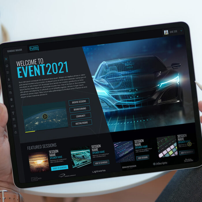
Design for scalability and growth.
A good design system is not simply created and then considered a job well done—It is designed to evolve and grow over time. Whether it’s different iterations of a component or an entirely new theme for a digital product, the design system should scale as the product evolves. As Hubb continues to add new features and functionality, we adapted its design system to evolve with their needs. This scalability allowed us to create new features, layouts, and even entirely new product offerings with extremely high efficiency due to quicker iterations, faster prototypes with higher fidelity, and finalized solutions that were development-ready with little to no documentation required.

Keeping it agile and flexible.
While it may seem that having every asset and component outlined with their rules and uses makes for a rigid and stagnant system, it’s quite the opposite. The system thrives on its agility and ability to evolve. While some common traits may be static, others have flexibility built into them. This flexibility allows fresh ideas to bring innovation to a product while still maintaining consistency with the visual language system. We utilized this flexibility to create themes within the platform so events can have a more custom look and feel, but still feel like Hubb.

")