Seafair 2018 Campaign
Brand Audit
Branding
Brochure
Concept & Campaign Development
Concept Development
Custom Icons, Illustrations & Infographics
Custom Signage
Digital Marketing
Environmental Graphics
Illustrations
Maps
Marketing Materials
Posters
Print Campaigns
Print Marketing Materials
Product Packaging
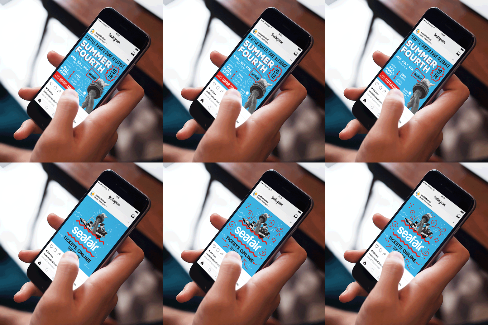
Social Media Ads
Tradeshow Design & Signage
Pacific Northwest Summit Award
Branding Seattle’s biggest summer festival.
Since 1950, nothing has been more synonymous with summer in Seattle than Seafair. The annual non-profit festival spans ten weeks and reaches more than two million people over 75 events. For its 70th year, Seafair is committed to uniting and celebrating all of Seattle’s diverse communities by offering affordable fun and activities where differences are welcomed, and every individual feels a sense of belonging to make memories that last a lifetime.
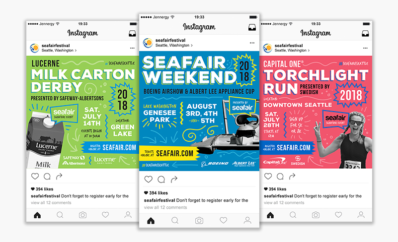
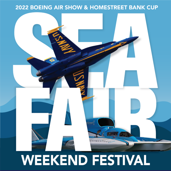
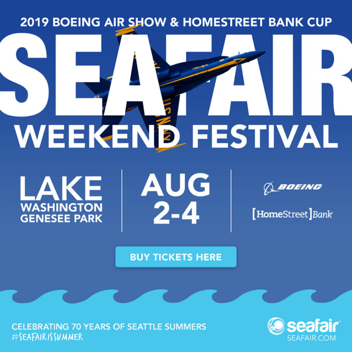
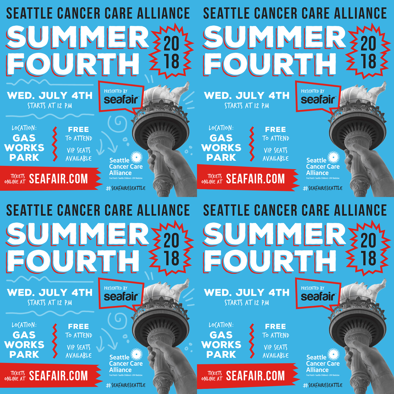
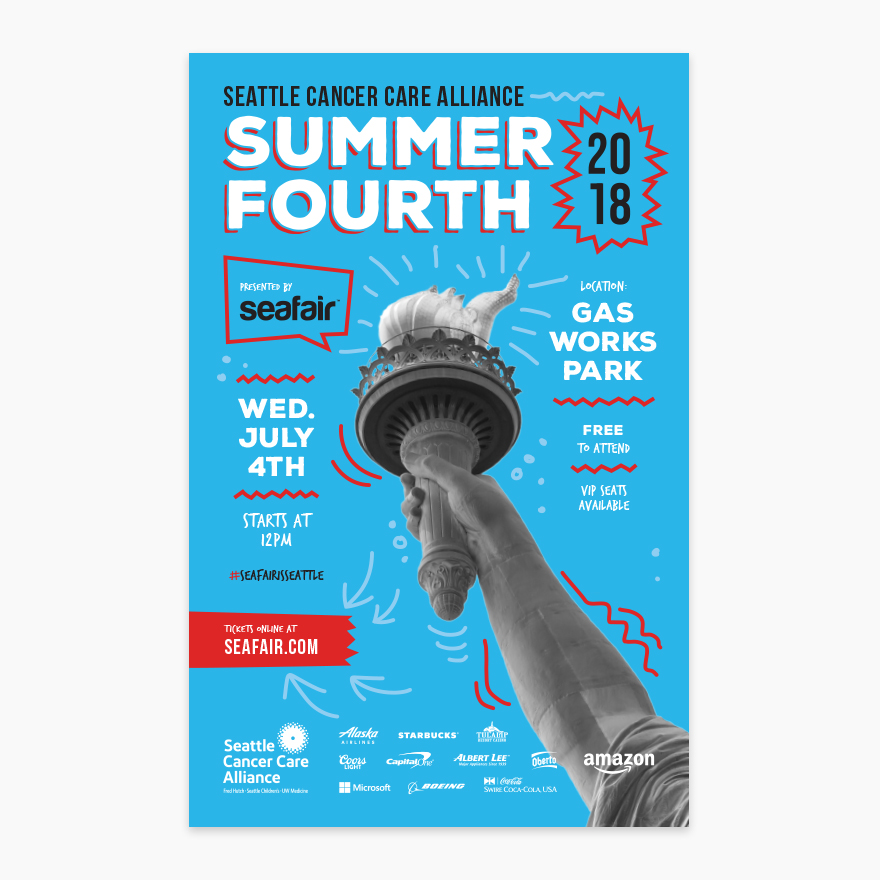
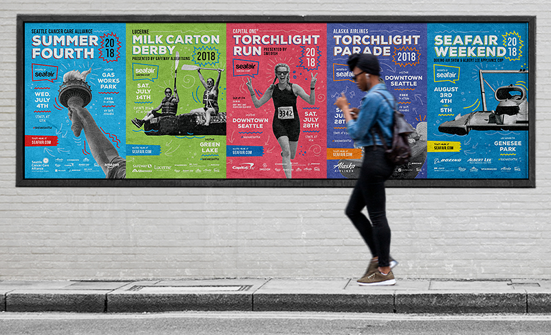
Seafair Signature Events include the Summer Fourth fireworks show over Lake Union, Milk Carton Derby races on Green Lake, Torchlight Parade, Torchlight Run, and the iconic Seafair Weekend Festival with the Blue Angels and hydroplane racing. These events have a long-standing history with local Seattleites and will soon with the numerous residents moving to Seattle’s rapidly expanding community each year. Our goal was to increase ticket sales while giving the Seafair brand a new, fresh look to attract a younger audience and speak to established fans.
Strategic branding to balance legacy and modernity while creating distinctive event identities.
We undertook a strategic approach by immersing ourselves in Seafair’s rich history and brand essence. Our goal was to modernize the visual identity, striking a balance between a fresh aesthetic and the legacy of 70 years of iconic Seattle events. Paying homage to the brand’s heritage was an important consideration in the branding of all Seafair events.
We also placed importance on branding each signature event to stand out from one another while still looking like a cohesive family. The selection of brand colors involves a meticulous process, aimed at giving each event its own distinct identity while harmonizing effectively when viewed collectively. We place a strong emphasis on readability and inclusivity, ensuring that event names remain easily legible, even from a distance and when combined with event-related graphics. Maintaining a consistent placement of event dates and locations, while highlighting our sponsors was important to successfully promoting the events. Hierarchy plays a vital role in ensuring the clarity of event information, including strategically positioning primary and secondary sponsor logos, as well as elevating the prominence of the Seafair brand.
The graphics we created for these events catered to their respective demographics and came together cohesively, effectively communicating the overarching Seafair experience. Whether attending one event or multiple, the design maintains a consistent appearance, reinforcing the connection to the larger Seafair brand.
Measurable success through increased traffic, app downloads, and higher ticket sales.
A brand new Seafair app incorporated the new 2018 branding elements and had over 12,000 app sessions with a seven-minute average session time. Website visits and social media impressions were up significantly over 2017.
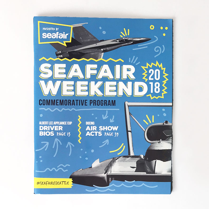
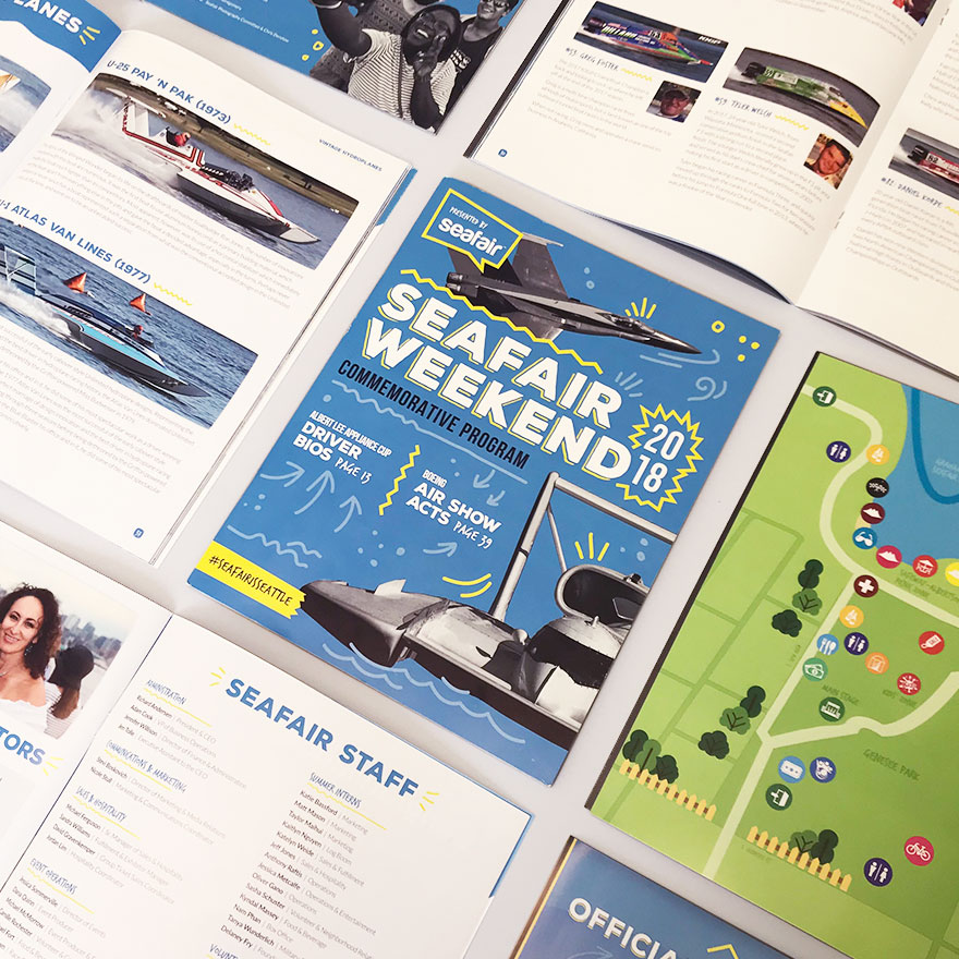
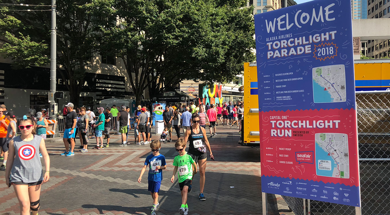
The new marketing materials gave Seafair relevance in a more modern era. The new branding was able to work across many formats – digital advertising, TV ads, print materials, event maps, email signatures –all with a cohesive look versatile enough to use across platforms.
The digital ads played the largest role in the 2018 campaign. The colors, fun fonts, incorporation of event photos, and unique graphics helped draw attention to the ads which directly impacted the success of this campaign.
