UW Medicine Diabetes Institute
Content Strategy
Copywriting
Custom Signage
Environmental Graphics
Telling a story with a unique installation.
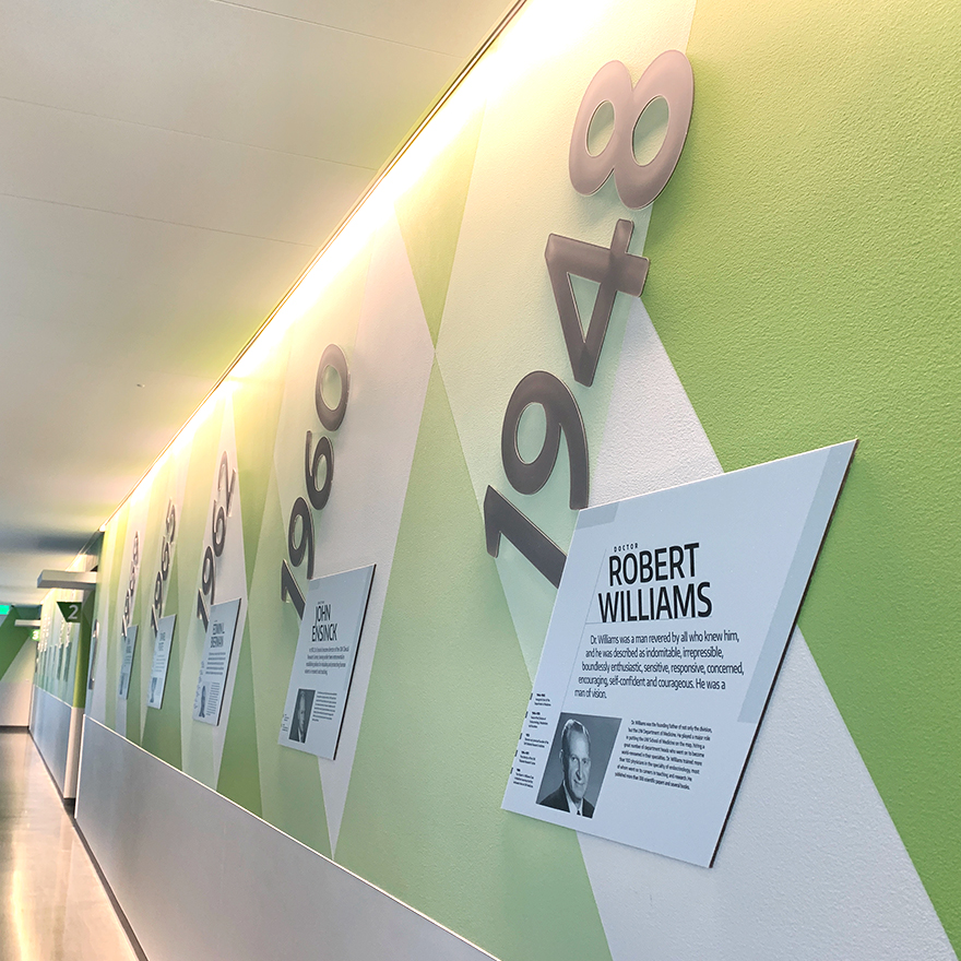
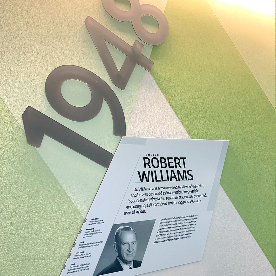
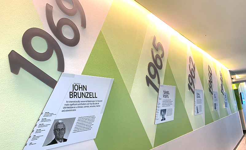
The Jennergy team was tasked to create a custom timeline environmental graphic for the UW Medicine Diabetes Institute (UWMDI) unique to their brand new lobby space to highlight their rich history of research and critical care. Collaborating with UW Medicine’s team of architects, project managers and interior designers, we designed this display through multiple phases as the interior of the state-of-the-art South Lake Union building was being developed. Our approach considered multiple external circumstances including the modern architecture of the building, the evolving interior design plan, and the client’s goals.
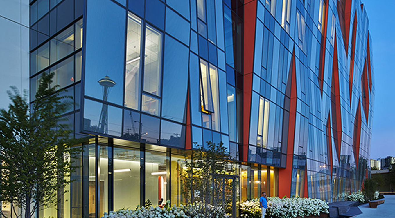
A creative concept for a creative space.
The client’s original vision for the space had the wall graphic on the back wall of the long lobby. However in our initial walkthrough of the physical space, we saw an opportunity to shift the project’s direction for a larger impact and higher engagement for future patients and visitors. We proposed approaching the stakeholders with a bigger idea that would really amplify their message and really tell their history with powerful visuals, rather than hidden on the very back wall with low visibility.
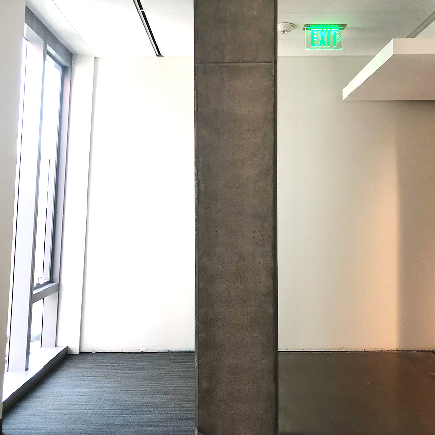
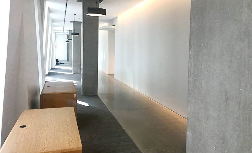
We redirected their concept, and got approval for a better application of the space to best communicate the timeline across a big, long wall seen by most visitors—all while keeping the client’s goals and building’s interior design in mind. Jennergy specializes in concepting big ideas for the largest wow factor and impact, and this project was no exception. The history of the UWMDI is filled with prominent figures who have made transformative medical history and we wanted to ensure the timeline wall graphic would make a significant impact as well.
A phased collaborative approach.
Phase 1: Construction
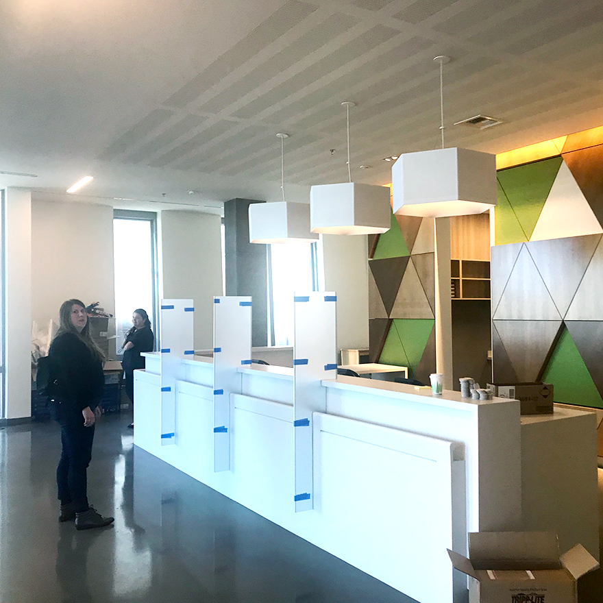
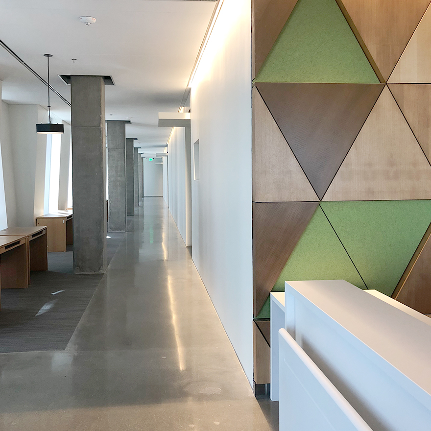
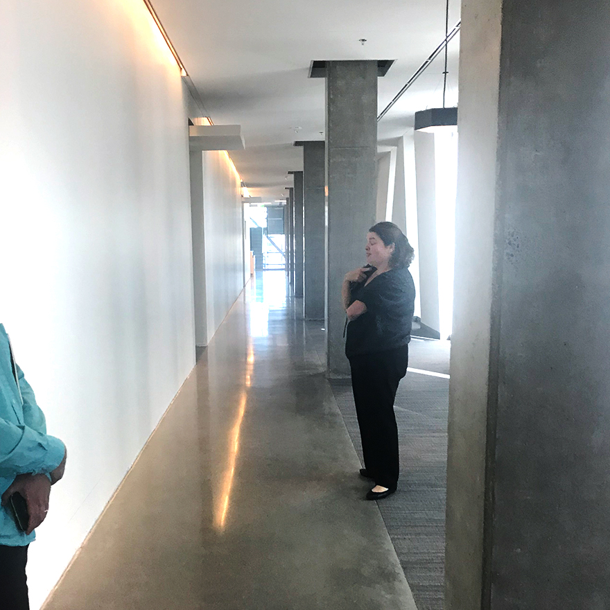
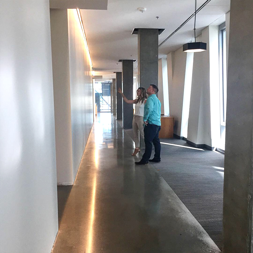
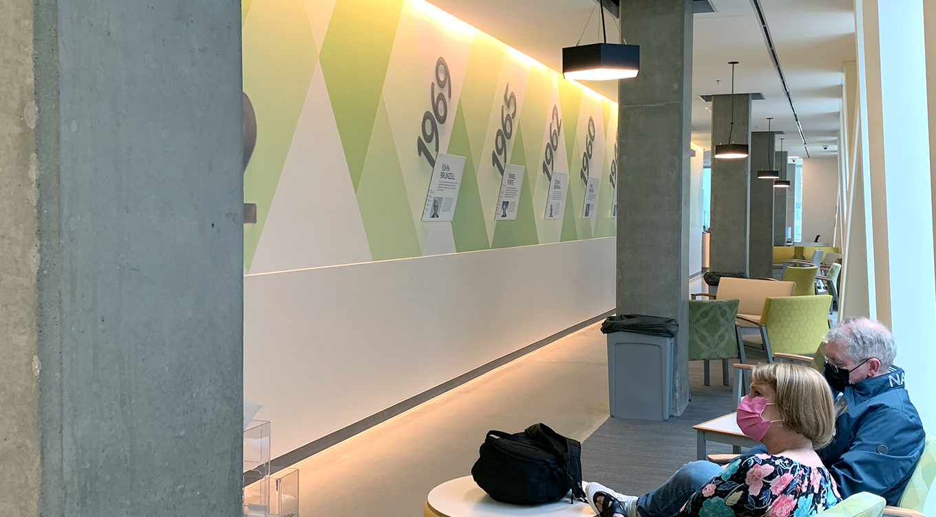
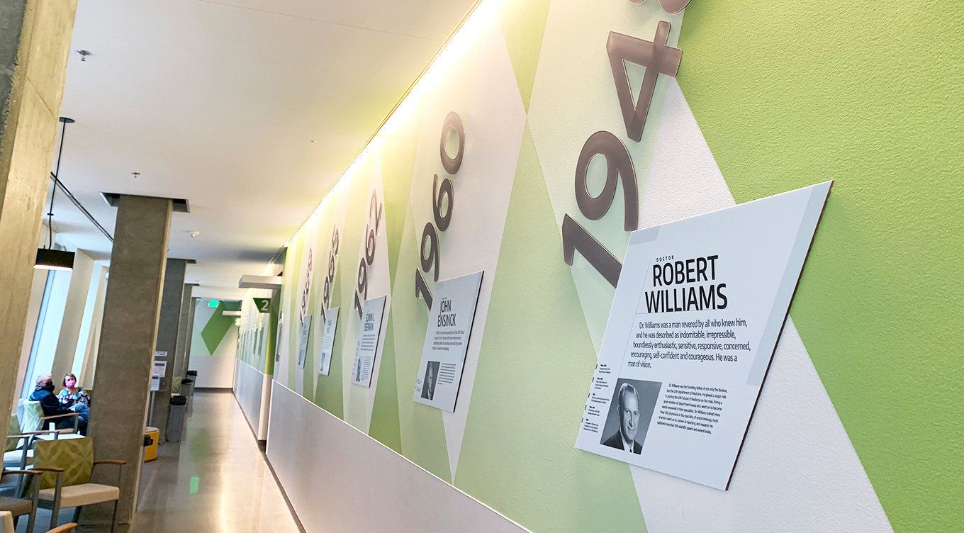
From the start this project was unique. When our team was brought in, the building was still under construction. Many decisions hadn’t been made and interior design plans were just that—plans. We visited the space with the idea of timeline wall graphics to be placed on the back wall of the lobby, but when we toured the entire space so we could design something to compliment the Institute as a whole. The lobby area is long and narrow, with large high windows along one side. The long, big, blank walls would soon have a pattern treatment with signage and a TV screen covering them. The tall ceilings, windows, and cement beams were just some of the beautiful architectural elements. We considered the space as a whole and the entire patient experience to compliment the environment and create visual interest without creating more “noise” or any interference. The goal for the timeline wall graphic was to get patients and visitors to be engaged and want to read each historic feature. After touring the area, we knew the far back wall wasn’t the answer. We worked with the client and stakeholders to utilize the long wall for the timeline graphics to better captivate their audience. This not only gave us much more space to work with, but would display the timeline prominently for patients and visitors.
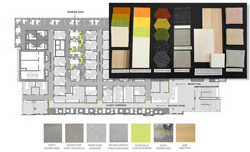
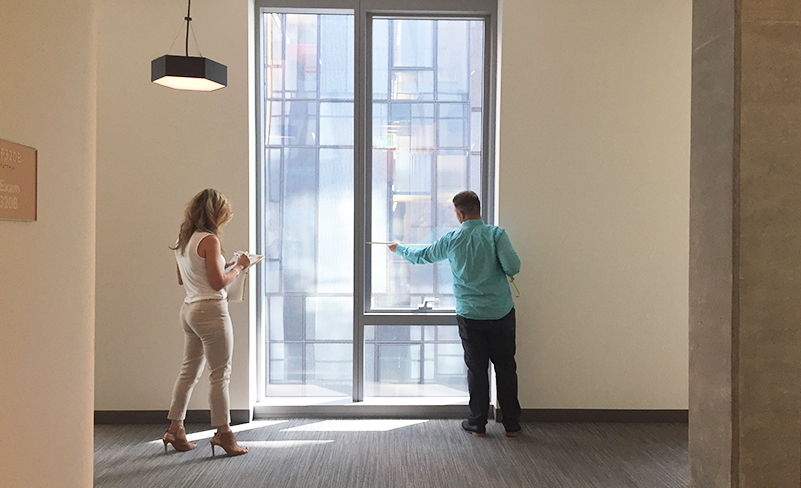
We then got to work measuring, planning, and collaborating with UW Medicine’s team of architects, project managers, and interior designers to create something to complement the space and the surrounding elements. The high windows were measured to echo the size of the opposite timeline wall. The design of not just the UWMDI’s floor but the entire building was considered. We poured over the interior mood boards, construction blueprints, and the client brief for a cohesive design plan.
Phase 2: The element of surprise
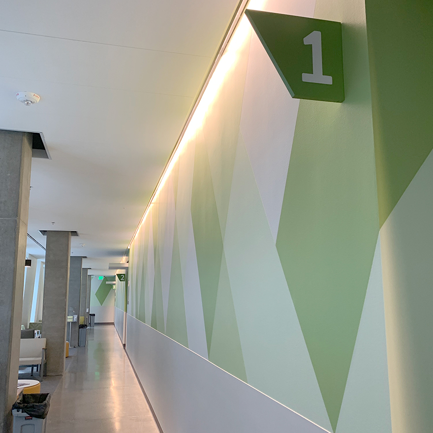
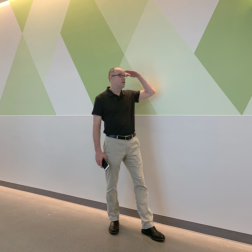
With the plan for a floor-to-ceiling timeline graphic in our heads, we returned to the space to see the newly painted patterned wall. Surprise! The wall was painted a modern, bright, geometric pattern—but only on the top half. The lower half had been covered with a white protective cover to account for the medical equipment and carts that would soon be traveling the halls. So we had to adapt our concept to accommodate. The timeline concept was tweaked to fit above the wall cover, which came up quite high. We also had this busy, bright geometric pattern to work with, so we used it to our advantage in our design. Incorporating the angles of the wall pattern into the final concept provided a dynamic and engaging timeline that complements its environment.
Phase 3: Installation
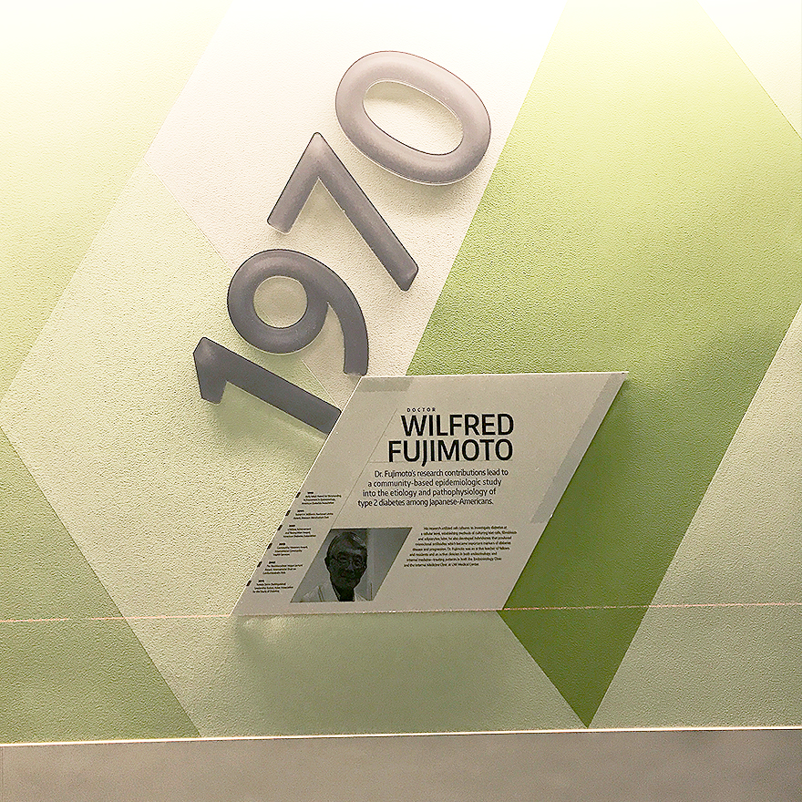
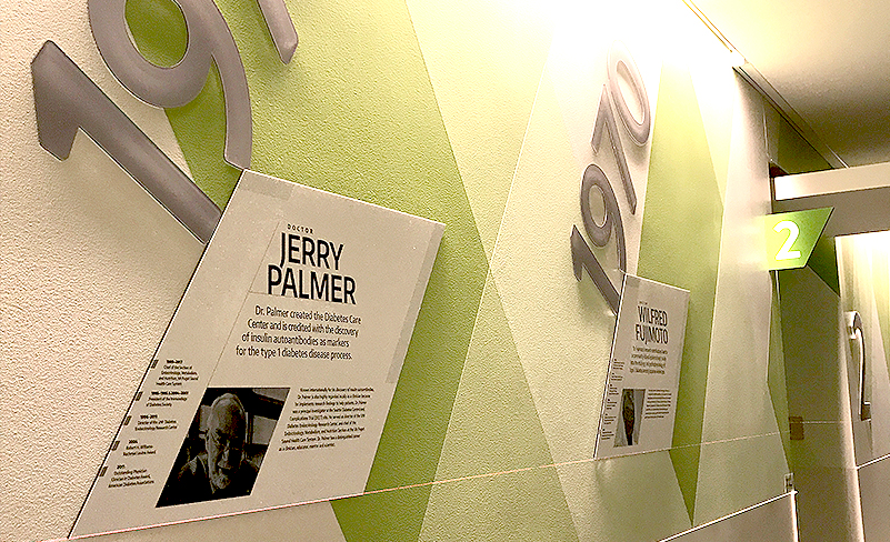
We were present for the installation of the timeline wall graphics—we must oversee the installation to ensure a perfect application from start to finish. Accounting for the dynamic painted pattern along with our careful measurements meant making slight adjustments to placement so the finished graphics look their best. The signage team was wonderful to collaborate with, and we appreciated how much they cared about those little details. A great deal can be accounted for in advance with careful planning and mapping, but seeing things in person often leads to necessary tweaks for a successful installation. After all, our vision is only as good as the execution of the final deliverable.
Phase 4: The big reveal
The interior of the building, additional signage, and the finishing touches of the wall graphics finally were completed. However, COVID-19 restrictions meant the building was closed to the public (including us!). We waited almost a year to see our hard work in its final format before being able to see the entire project realized. We always want to see our projects from beginning to end, providing strong attention to detail for high-quality design. It turned out beautifully and is such a special feature of the UW Medicine Diabetes Institute lobby.
We have worked with the following UW entities:
UW District Leadership Design Lab
UW Finance and Facilities
UW Surplus
UW Medicine
UW College of the Environment
UW Medicine Advancement
UW Rowing
UW School of Admissions
UW School of Nursing
UW Foster School of Business
UW The Robinson Center
UW College of Education
UW Institute For Health Metrics and Evaluation
UW Institute of Translational Health Sciences
UW School of Social Work
UW Institute for Science and Math Education
UW Information School

