WhoCanUse: Color Comparison for WCAG
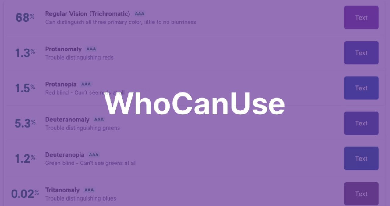
At Jennergy, we work to design compliance-friendly websites and make your website accessible to all users—which is why we love WhoCanUse. Most accessibility tools show the contrast ratio and WCAG Grade between two colors, WhoCanUse takes it a step further by showing what different visual impairments actually see. It also brings attention and understanding to how color contrast can affect different people with simple explanations of each impairment and the percentage affected. This percentage can be useful in gauging your adjustments if you are trying to appear best to the broadest group or apply to a specific group. If you’re working on a SaaS app or anything that’s going to appear on mobile, it also shows how the colors will look on a screen in direct sunlight and night shift mode. There are a lot of reasons to make sure websites are accessible, but as designers, we love to have an accessibility tool that still prioritizes the visual appeal.
