Digital Design Trends of 2023
Posted
04.22.2023
Staying up to date on the latest trends in the digital realm will definitely keep you on your toes, and it’s always interesting to see what sticks. Our team is always sharing articles, interesting projects, and discussing what we’re seeing in the industry. We will share not only our top 2023 digital design trends to watch for, but also what our clients request for their most recent projects. When we look at current and recent work, it’s clear these trends have staying power.
Dark Mode
You’ve likely noticed almost every app on your phone has the option of flipping to dark mode—if it’s not the default already. While a lot of the benefits of dark mode are related to phone usage (extended battery life, less eye strain, etc), it’s a popular style for websites too. Dark mode can convey drama and is popular for tech companies. We love dark mode design, and think it’s a great choice for a bold, fresh look.
Web Accessibility
We’ve talked about the increasing importance of web compliance and the benefits that come with it; from trend reports to conversations with clients, it’s clearly top of mind. While website compliance guidelines are in regards to accessibility needs, they impact the visual design of websites. From colors with high contrast, to user adjustable layout, as well as font size for better readability, accessibility has become a major factor in web design.
Minimalism

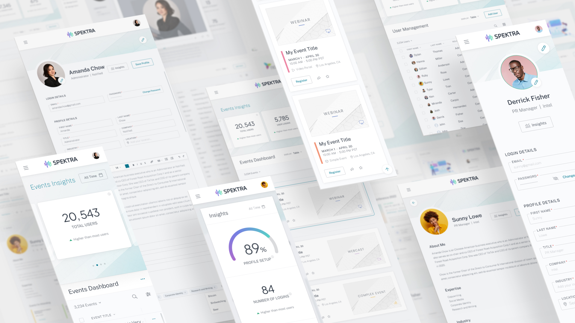
Bold colors and animation isn’t the right approach for every brand. One of our most favorite trends has been making a comeback, and that’s minimalism. Minimalism has become increasingly popular, using limited color palettes and only as many design elements as necessary. The style focuses on a large amount of white space, and relies on a balance of design elements to provide a fresh, inviting layout that incorporates proper information architecture. The visual simplicity of this style increases readability, is user-friendly, and provides a more modern style and look to layouts.
Mobile-First

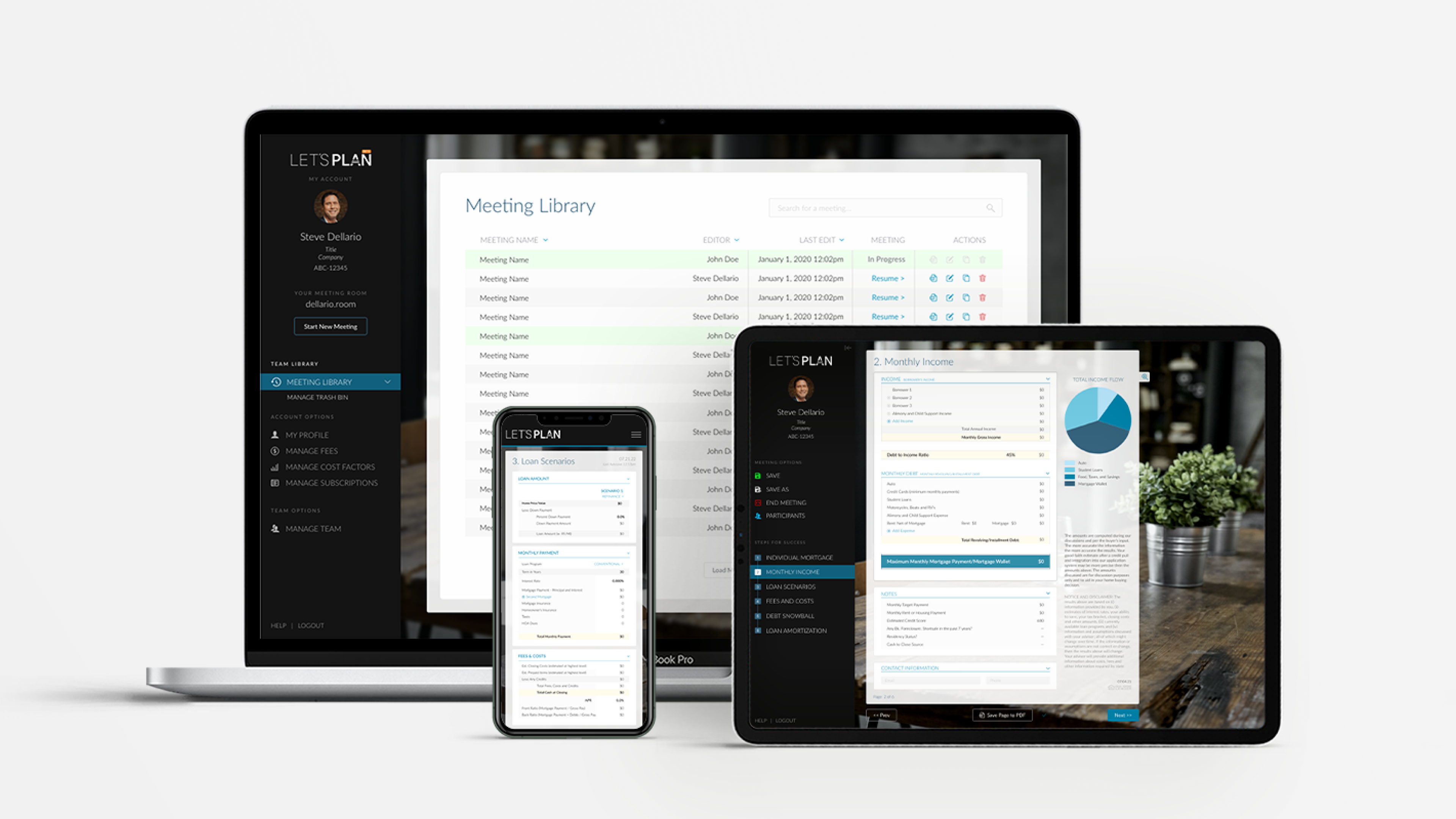
Mobile-friendly design is nothing new, but it’s more important than ever with approximately 85% of Americans owning a smartphone. Users rely heavily on their phones to find information and handle other tasks and if a company’s website doesn’t work well on mobile devices, it could easily result in lost business. When designing with mobile in mind, consider the ease of use, hierarchy of information, and other design choices that affect how users will perform necessary tasks on a website.
Animation and Scrolling Effects

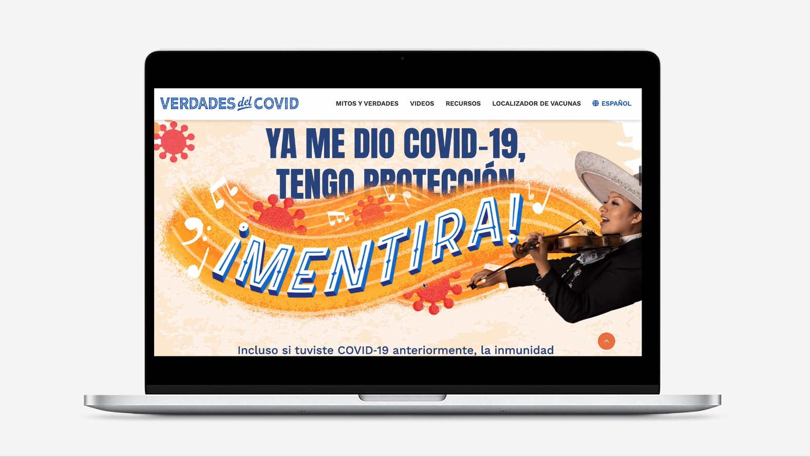
A picture may be worth a thousand words, but a scrolling effect or animation can make for a unique and dynamic website. In a recent project, we used this scrolling effect in the Veredas del COVID site for the WA Department of Health. This animation helped convey their information in a fun, dimensional way. Animations can not just add visual appeal to a website, but can entice users to continue to scroll and read more while helping keep them engaged with the site content for longer periods of time. These elements often easily translate to video and can carry over into other digital channels for brand consistency.
Ready to be Trending?
Incorporating trends with a look that fits your brand can make a huge impact with your customers. If you’re looking to improve your website functionality, or simply want to give it a refreshed look, the Jennergy team is always up for a challenge!


