Config 2023: A Designers Branding Perspective
Posted
07.13.2023
We love Figma!
Now with that being said, we as designers always love taking off those rose-colored goggles and giving honest critiques. Having just recently attended the Config 2023 event, we figured this was a great opportunity to do just that and talk about the experience from a “designers” perspective. And when we say “designers” perspective, we mean those things that we designers love to geek out on such as event branding, tradeshow booth design, swag bags, mobile app experience, signage, and print marketing collateral.
Before getting into the details, we want to say hats off to Figma and Config 2023! Three years ago this event brought only 800 in-person attendees, while this years event had well over 8,000 attendees, along with hundreds of thousands live-streaming from home and work. This is quite the accomplishment, and means they are doing something right!
Overall event visual branding.
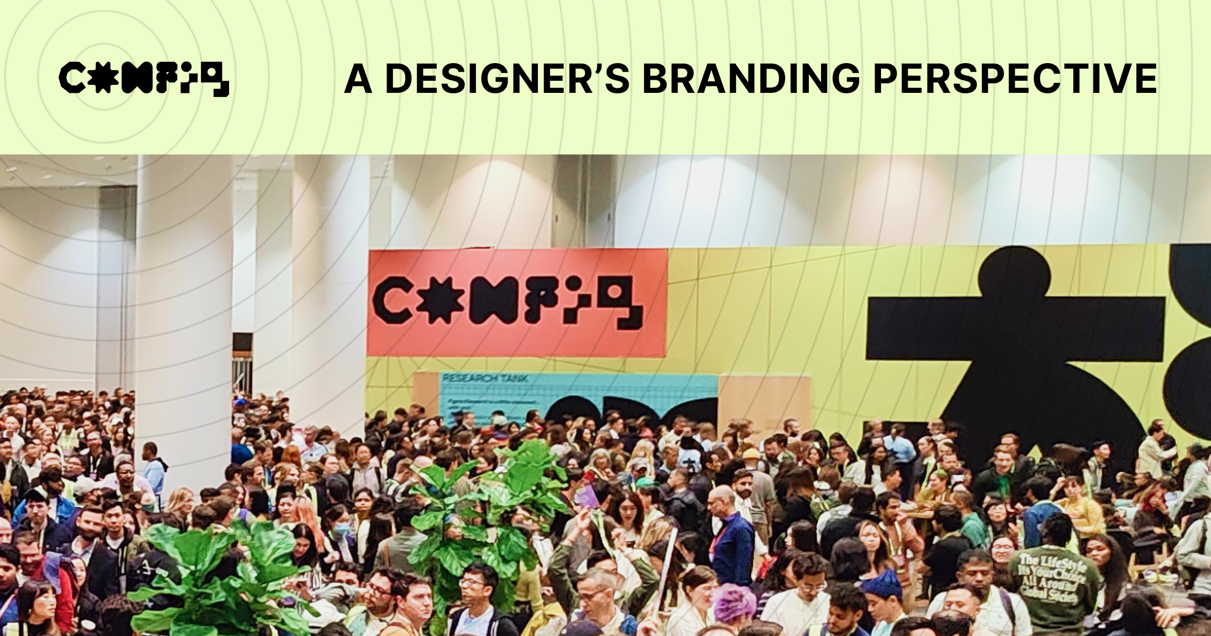
We gotta say that we love Figma’s fun and quirky branding. Seeing it in action at a conference in both digital and print was extremely exciting! Having done quite a bit of tradeshow design ourselves, we were very impressed with the brand applications throughout the event. However, there was one execution that stood out amongst the rest, and that was the custom motion graphics and animated logo incorporated for the mainstage and conference sessions. The motion design really leaned into the playfulness of the brand, and incorporated some fantastic sound design that really elevated that super fun and playful vibe to the next level. Besides the impressive use of motion graphics, the printed materials for the event were also on point including stickers, name tags, signage, and general way-finding. There definitely were a few misses in our opinion on the digital side of things (more on that below), but overall it was a very cohesively branded and well-designed event experience.
The in-person experience.
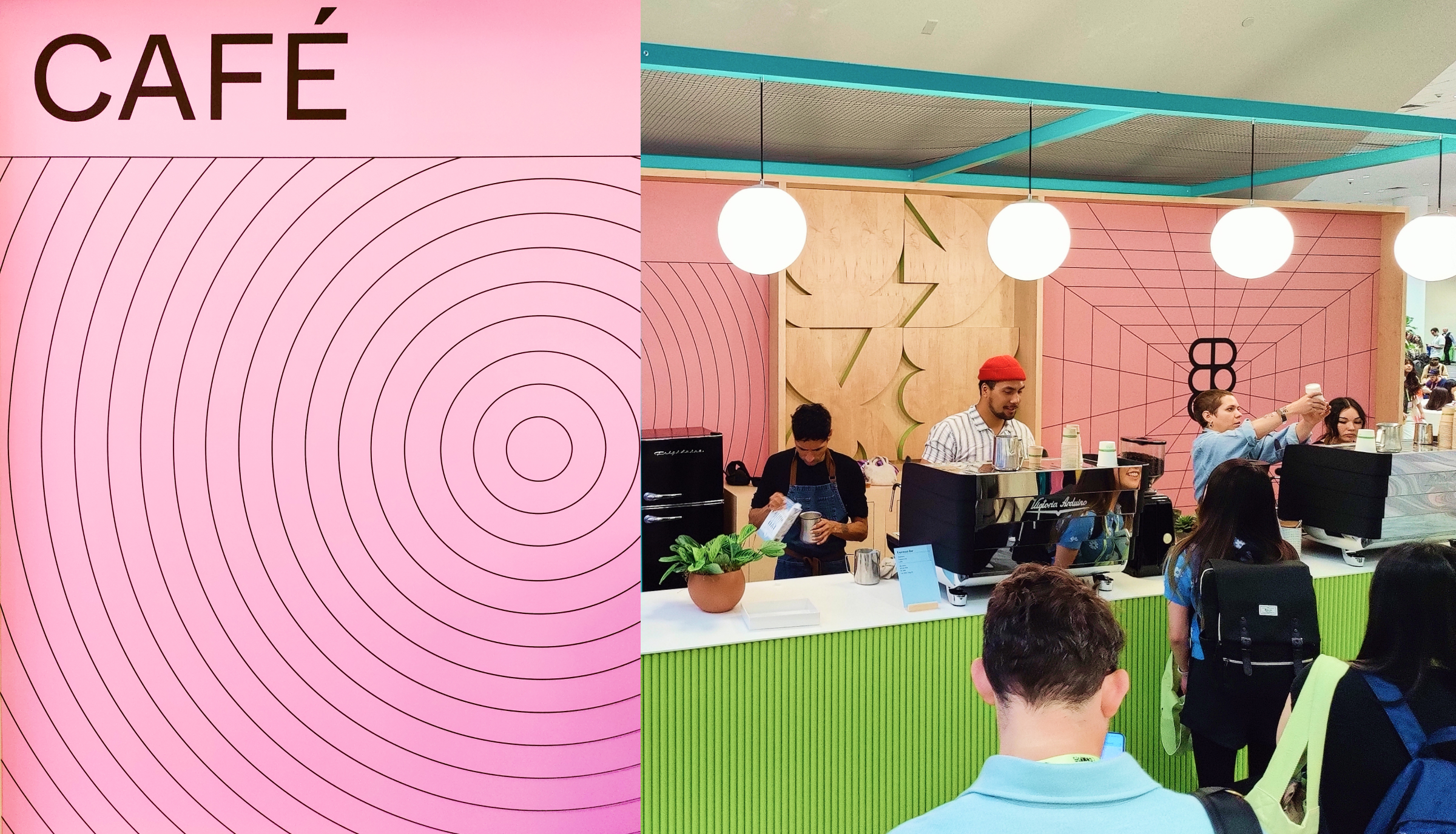
For being one of the first in-person conferences attended post-pandemic, we were very impressed with Config’s brand application throughout the venue and the many interaction and engagement opportunities. From fun and colorful signage throughout the event, to an awesome swag bag with tons of goodies, they really went all-in when it came to applying their branding throughout the space. They even went so far as to create a “Figma Cafe” pop-up, complete with baristas offering some fantastic coffee and tea options.
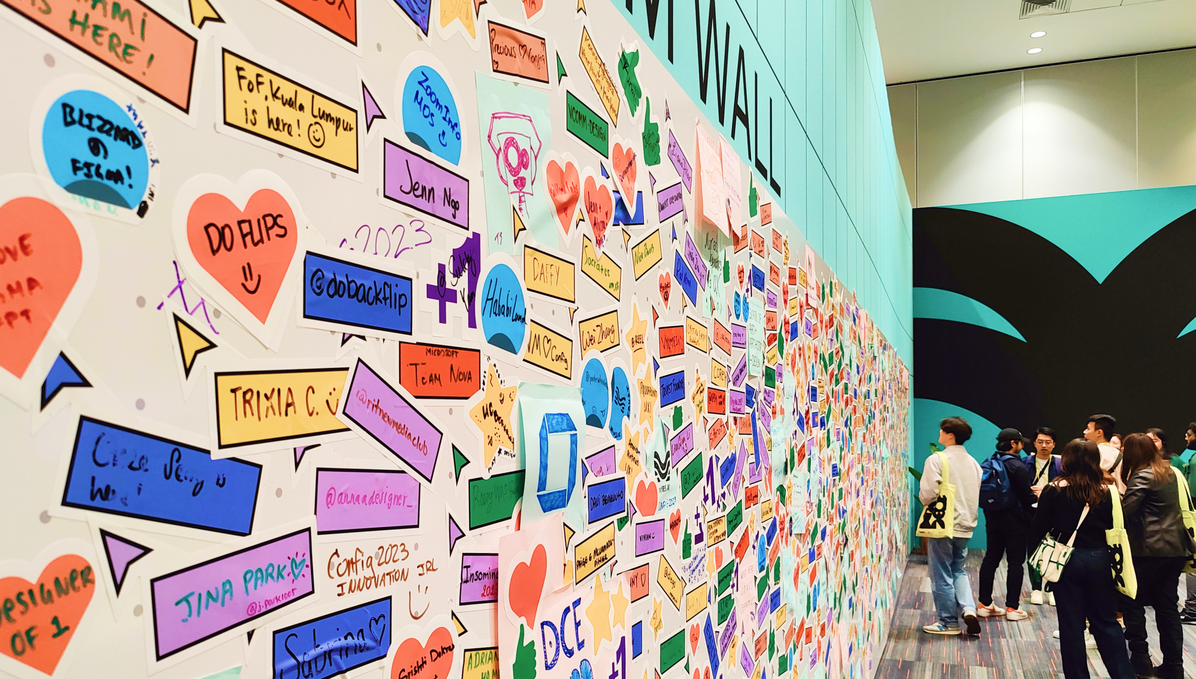
From the engagement side of Config 2023, they had plenty of things to explore, such as a dedicated Sponsor booth area, where one could learn a bit more about companies that had created some pretty impressive plugin integrations with Figma. They even had a UX Research Tank, where you could give feedback about the event experience or what you might like to see next with the software. However, one activity really stood out above the rest and that was the “FigJam Wall”! To highlight their more recent software endeavor FigJam, they dedicated an entire wall of the main lobby as the “in-real-life” blank FigJam canvas. Attendees could draw with markers, adding things like notes, hearts, likes, drawings, thumbs-up along with tons of other fun interactions from FigJam. This definitely was one of the highlights for getting attendees engaged, and was one of the prime spots for awesome photo opportunities (I mean, who doesn’t like drawing and sticking things on walls?).

The FigJam Wall for Config 2023
The digital experience.
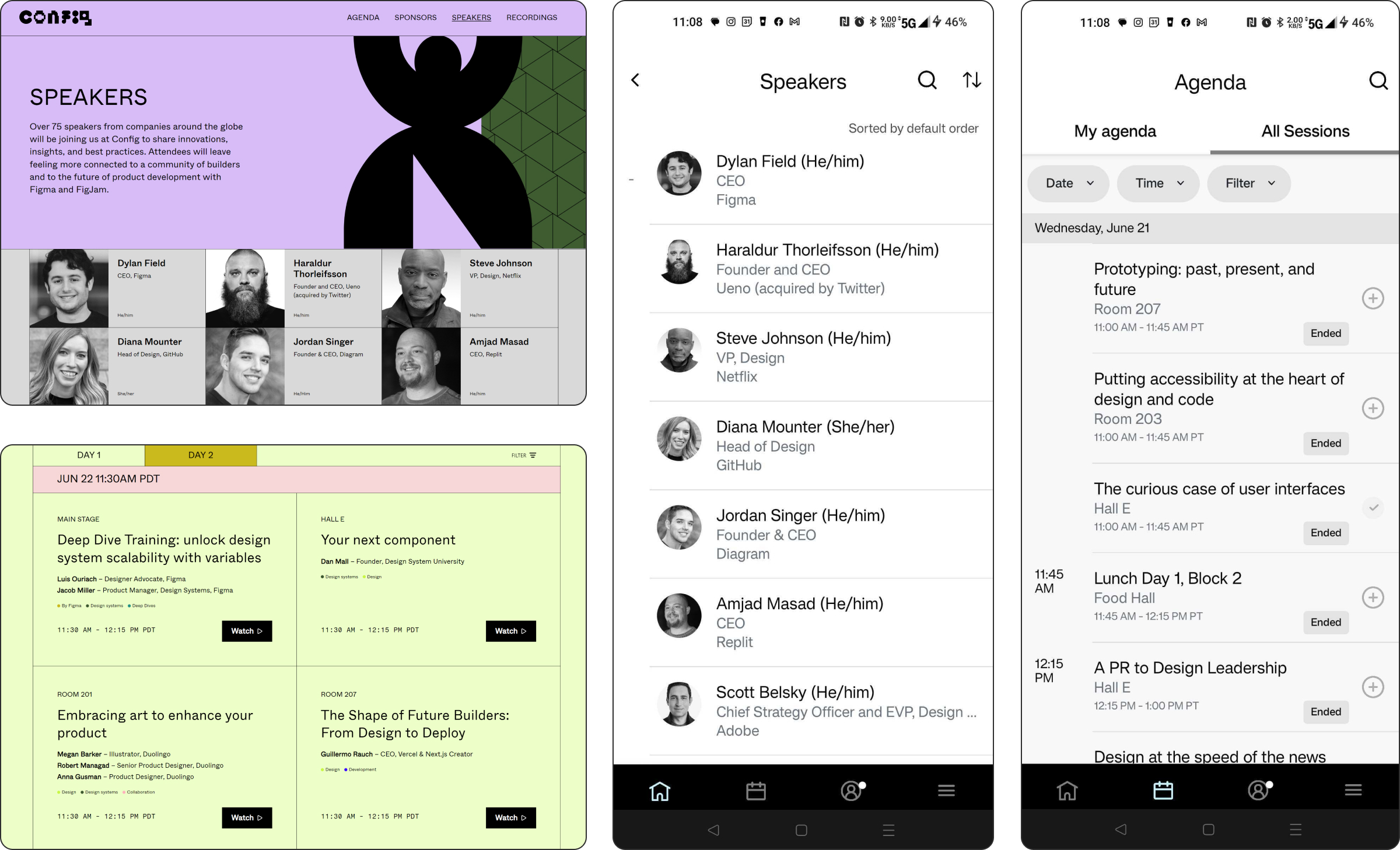
When it comes to all things digital, Figma is usually on point. As we said earlier, their implementation of video and motion graphics for the sessions was fabulous! Even the event website was dripping with that Figma branding, using various bright color blocks and keeping the design minimal but fun. We enjoyed navigating through the website and reading about the upcoming speakers, sessions, and keynotes for the event. However, the event mobile app for the event sessions definitely felt a bit like an afterthought and was desperately lacking that fun Figma branding. Feeling very much like an out-of-the-box white-labeled app, it was very visually bland and a far cry from the pre-event website visual experience. The mobile app also had quite a slow load time whenever launched, and failed to provide some key information for certain sessions on the schedule (for example, which sessions were for in-person attendees only). Networking opportunities in the digital space were also a bit lacking. With a dedicated Slack workspace being used as the primary platform for digital networking at the event, it felt very separated from the event activities. We would have loved to have it more integrated into the event experience.
Final thoughts.
Being the first time Figma had hosted an in-person conference of this size, we were extremely impressed. Although some of the event’s digital aspects lacked that fun Figma branding minimalism and charm, the in-person brand experience was definitely a home run. Here is a summary for the TLDR (too long didn’t read) folks:
Things that we thought were really awesome!
- Event Website Visual Branding
- Branded Coffee Pop-up
- Sponsor Booths
- UX Research Booth
- FigJam Wall
Things that we thought were not so awesome:
- Event Mobile App & Schedule
- Slack Channel for Networking
Things that we would have loved to see:
- Digital Sponsor Booths
- Event Focused Digital Networking
- Well Branded Event Mobile App
That’s a wrap, till next time!


